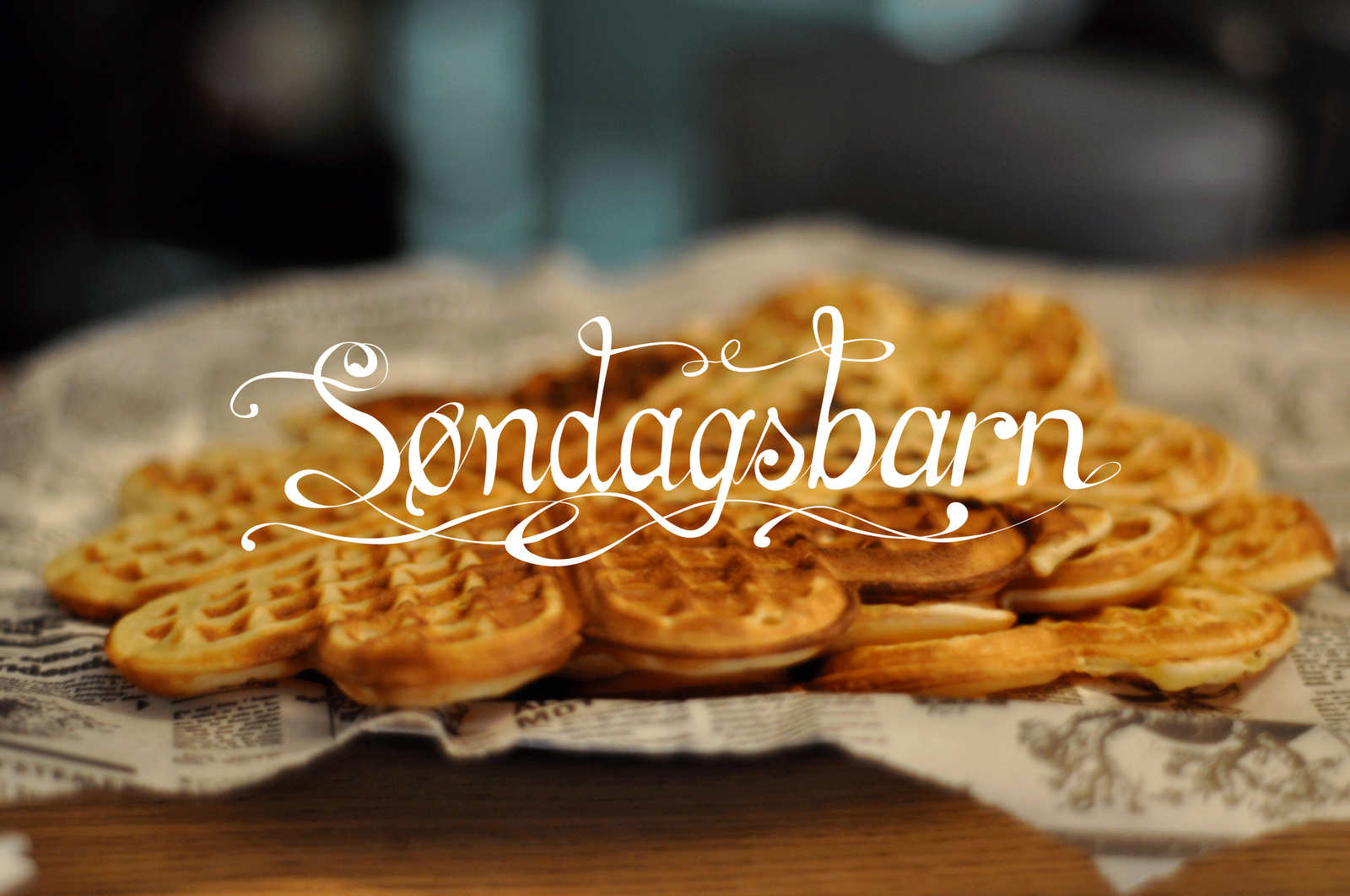
I use tactile approaches to every invitation. I play around with techniques to interprate the events, often creating small installations. I aim for making it feel warm and inviting, yet underground and of the map. A balance between homemade and professional. These invitations are a part of a co-design project, where we involve people in the creating and development of the Søndagsbarn concept. (This involves music, cooking, designing products and creating connections across fields of professions) Its created by me and fashion designer Marthe Næstby.
Appletheme at Søndagsbarn. Calligraphed custom made font, processed in illustrator and burnt into woolen fabric. The text on the apple is also done in laser. The aim of this poster is to illustrate the feeling of enjoying a warm october evening with good foods, drinks and a movie together with friends.
A gift for a retiring professor at the royal academy of theater. Handbound book containing personal handwritten greetings from collegues, bound together with shoelaces. The dvd pocket is calligraphed, containing greetings from former students. The red velour cloth was collected from the schools own theater props. Handwritten calligraphy laserburnt into the cloth and the paper, giving it a tactile and personal feel. I wanted to inhence that this is a gift for someone who´s left imprints in the education of our finest actors.
Handprinted posters for the band Firefly Effect. I interperated the personality of the music and the band in the making of the typeface. The music is created by several units and layers creating a whole, and the dots look like fireflies seen from a distance. The process was done in many layers converting analog to digital and back again to analog.
To see more of the prosess of the making, go to my schetchblog!
Letterpressed with my brand new leadtypes "headline" on pink suede. Flyer promoting the opening night of the brand new sunday bar concept we´ve just started at the academy!
We went to visit designers in Tokyo, and made this small handbound (Japaneese binding technique) and letterpressed leaflet to give out as a gift. The Japaneese are interested in names and meaning and it contains the names and meaning of everyone in the group that went with us.
My sister is an artist working in various fields - she just created a blog where she shows of one of her latest projects. I made the logo using old wooden types which i letterpressed before processing in illustrator.
Weddinginvitations. The couple have a taste for western style and old vintage aestetichs. To take an victorian handmade approach suited their style perfectly. Branded balsatree and handmade envelopes.
Final bachelor project, Oslo National Academy of the Arts. Profile for the cosmetic company Esthetique. I made a new logo for the excisting company and in addition i focused on profiling a proposed new departement for younger women. I gave it a more expressive and playful approach to cosmetics and focused on the fact that they sell the makeup brand MAC.
Set in 9 pkt. Bembo, and 12 pkt. Palantin. Because of missing uppercase types, i had to find an alternative. I think it was an advantage. All done by hand with leadtypes. This is where my love affaire with letterpress started.
Collaboration with Adrian Storm. Theatreprogramme for the bachelorperformance of the acting students at Oslo National Academy of the arts. A minimalistic preformance of Arthur Millers "the meltingpot". We had no money, so the limitations was a black and white printer.
I embroidered a poem by a famous Norwegian poet named Haldis Moren Vesaas. The poem is called While you sleep. The fragility of the poem is hightened by the choice of illustration technique and suits the vulnerability of the condition of being asleep.
The calendar consist of 24 hand drawn miniatures. I focused on the romantic image of Norwegian nature, and wrote rhymes on how bad things can get if we don´t take action and protect the environment.